XVII: Font-astic!
- de Gustibus
- Aug 31, 2023
- 5 min read
Updated: Nov 20, 2023
Having received a heartfelt comment from a loyal reader of this miscellany (apparently there are one or two such brave souls) that the previous post may have, in some way imperceptible to me, been slightly verbose, your hardly-ever-loquacious Archivist took it upon himself to attempt a more visually-oriented offering this time.
As noted in some previous entries, good graphic design is pure eye candy. With this post, we will be reviewing pieces from The Collection that represent a sub-category of typographic design- artistic printing. In a few books about, but mainly books of, this genre I hope, for the most part, to let the images speak for themselves. Res ipsa loquitur.
Words about letters
There is not an overabundance of books on the topic of artistic (or decorative) printing, but the following examples provide a sufficient background to this entry’s topic. Most examples of artistic printing come from printers’ exchanges, late 19th century bound volumes collecting show-pieces submitted by individual print shops. Originating in Britain around 1877, they would go on to inspire similar endeavors on the Continent and in the Colonies.
The Handy Book of Artistic Printing. A Collection of Letterpress Examples with Specimens of Type, Ornament, Corner Fills, Borders, Twisters, Wrinkles, and other Freaks of Fancey. 2009. Softcover book by D. Clouse and A. Voulangas. Princeton Architectural Press. About 20 x 25 cm., 232 pp.
See? I’m not the only one with a playful sense of verbosity. This volume presents a nice collection of examples in color of printers’ creativity. Most plates are from printers’ specimen exchanges of the late 19th century with a few decorative typefaces included for balance.


The Rise and Fall of the Printers’ International Specimen Exchange. 2012. Hardcover book by Matthew McLennan Young. Oak Knoll Press. About 22 x 28 cm. 154 pp.
Half of this scholarly volume details the history of the aforementioned printers’ exchanges with a quantitative review of their output. The other half reproduces in color a healthy sampling of the printer’s art in the late 19th century.

A graphic representation of the rise and fall, with apologies to the honorable Mr. Gibbon (FRS).

To sate the appetites of any Victorianiaphiles amongst the readership.

And let’s not neglect those energumen of Japonisme...
Graphic Design Before Graphic Designers. The Printer as Designer and Craftsman 1700 – 1914. 2012. Hardcover book by David Jury. Thames & Hudson. About 20 x 30 cm. 312 pp.
This hearty volume alternates quires of informative pulpy monochrome pages with slick colorful plates. Over a two-century period, the author provides numerous examples of beauty in what would later be known as graphic design, from letterheads and labels to, of course, printers’ exchanges.

The pulpy part.

More colorful examples of artistic printing reproduced.


Bound to Please
With uncharacteristic restraint and breviloquence, a few examples of printers’ compendia, antique and vintage Midcentury, are herein examined.
American Printers’ Specimen Exchange, Vol. III. 1888. Hardcover book edited by Ed McClure. Buffalo, N.Y. About 23 x 29 cm. unpaginated, approx. 180 pp.
A fine example emulating the beauty of a British printers’ exchange heralding from the Colonies.While full pages are usually depicted for context and proportion, some here will instead be shown in detail.


It is indeed difficult to obtain a good pair of dogskin gloves these days.




West Virginia Inspiration for Printers 1950, 1951, 1952. 1953. Hardcover book binding volumes 179 – 190. West Virginia Pulp and Paper Company. About 24 x 31 cm. Unpaginated, approx. 255 pp.
Originally conceived as a way to market the paper company’s products, the annually-issued booklet evolved into an anthology of traditional and modern imagery derived from the company’s client base. A non-descript cover and title page belie the colorful contents.





Penrose Annual. Vol. 47. 1953. Hardcover edited by R. D. Fishenden. Pellegrini and Cudahy, New York. About 22 x 29 cm. unpaginated.
Picking up the mantle of the printers’ exchange compilations was the Penrose Annual which did pretty much the same thing, but with the addition of articles about the printing industry. It was published regularly from 1885 to 1982. In this volume, the printer’s art encroaches into the domain of book illustration, further blurring the lines between art and commerce (if such distinctions ever existed).




Specimens: A Stevens-Nelson Paper Catalogue. 1953. Hardcover catalogue. Stevens-Nelson Paper Corporation. New York. About 26 x 30 cm. unpaginated, 107 specimens.
Technically a catalogue for the Stevens-Nelson Paper Company, this beautifully-bound volume provided examples of graphic design printing on differing types of papers resulting in an experience both tactile and visual. Here, the paper itself becomes part of the design. Further adding to the artistry of this endeavor is the apparent fact that each volume was uniquely bound.


Loose Leaves from Fallen Trees
Oftentimes books of plates become “separated” (or “broken” in codicological parlance). While this practice may cause concern amongst preservationists, it does allow for the greater dissemination of the book’s contents (and appreciation), albeit amongst the hoi polloi.
Écritures Anciennes. Spécimen Ecritures Modernes. Galerie Compositions Ecritures Anciennes et Modernes. c. 1835. Single leaves on paper. Chromolithographic prints by Émile Simon fils. Strasbourg. About 29 x 47 cm.
Single leaves designed by Jean Midolle from his collection of fanciful alphabets and decorative tableaus. Rather than aggregate examples from other printers, Midolle took it upon himself to create a compendium of examples both typographic and artistic from historical periods.


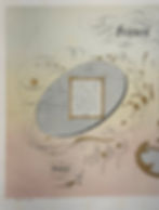


Internationaler Graphischer Muster-Austausch des Deutschen Buchdrucker-Vereins. Dritter Jahrgang. 1891.
Single leaves on paper. Published by W. Drugulin, Leipzig. About 23 x 29 cm.
A continental version of the Printers’ Specimen Exchange, this collection contained samples primarily from Germany and Austria-Hungary, but also a few from Russia and the Colonies for good measure.


Advertisements for Ault & Wiborg Company, Publication Unknown. 1898. Single leaves on paper. Cincinnati, Ohio. About 22 x 30 cm.
To market their inks, the Ault & Wiborg Company (founded 1878) commissioned beautiful advertisements from contemporary artists and clients, among them Toulouse-Lautrec. Presented here are two particularly striking examples. Nihil est novum.


Design sample by Otto Weisert, Publication Unknown. c. 1900. Single leaf on paper. Stuttgart. About 25 x 35 cm.
Best known for his cursive Jugendstil font, Kalligraphia, Otto Weisert’s type foundry produced many examples of artistic printing, of which the following is but one instance.


Sometimes a label is just a label....
But this isn’t one of those times. With apologies to dear Sigmund, these early Twentieth Century instances of cigar labels demonstrate applied examples of artistic printing in the marketplace. The labels are each about 25 by 16 cm.


Finally, to close out this sparsely contextualized post, a rendtion of Mr. Talbot in his lupine persona. And here you thought I’d forgotten all about my obsession with mosnters...

I hope that you found this visual foray into artistic printing both pleasing and inspiring. I also hope that you appreciated the near-Herculean effort required to publish this entry with such a dearth of commentary. Such succinctness of sentence structure is unlikely to be sustained.
Thank you very much for visiting. Please come back for the next entry of visual fancy and didactic scholarship.
Until such time, I remain yours, most sincerely,
le Compte Paul Gregoire de Gustibus

“Nothing is but what is not.”